
Energy Portal
the company name has been omitted for privacy
Tools used: Sketch, InVision Studio
Situation: A leading UK energy company planned to redesign their customer portal. They wanted their customers to be segmented so that they could serve information specific to each segment.
Task: I conducted intensive customer research as well as auditing the current portal and user sentiment. The project spanned over 3 months and as the only designer, my roles included, UX Researcher, UX Designer, UX Consultant and shared Project Management. Some design considerations included full adaptiveness from Desktop to Mobile, different information displayed for persona types based on various levels of admin access, data visualization and content personalization.
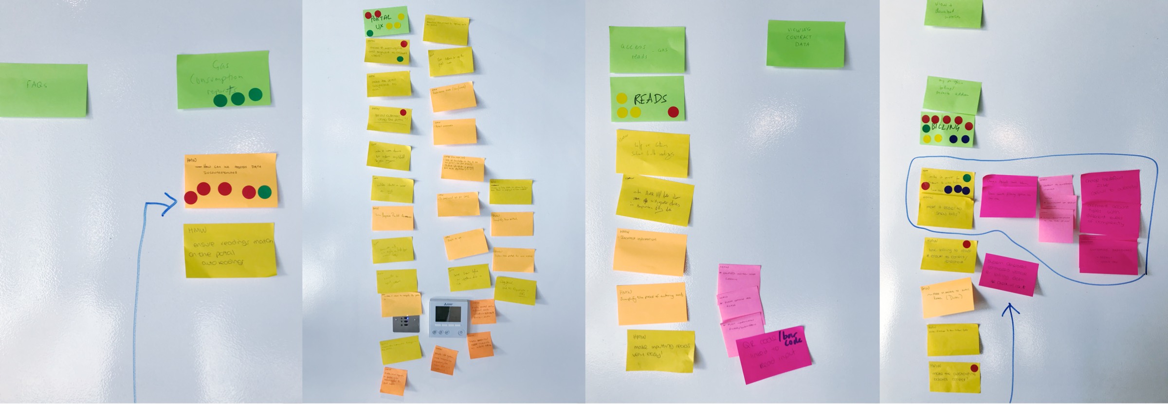
Action: Starting with an exhaustive audit of the current portal and customer feedback, I went on to analyze Crazy Egg heatmap data, Google Analytics, Customer Feedback, Reviews, conduct Customer Interviews, hold Design Sprints and Presentations as well as designing Wireframes for the entire portal while creating design notes and UX Best Practice documentation. My main focus was to create user journeys that were:
- Cyclical (creating a circular task that ended with relevant options and education)
- Contextual (actions are afforded relevant to the data that they were in proximity to)
- Interactive (all data points on charts and tables were links that showed graphical representations or linked away to larger related data sets)
Result: The first stage of the project was completed on time as scheduled and the second stage is about to start. I was only involved in the first stage which included the research, persona creation, user journeys, interviews, design sprints, full portal re-design wireframes, stakeholder buy-in and customer colaboration.
The first stage created a quantifiable benchmark that the second stage could be built upon. All of my customer behavior analytics and design assets will be used to explore the design process further. I focused on exposing current and possible design problems as well as creating future proofed solutions such as interactive data tables and personalized dashboard data visualization.
Behavioral insights
SMEs (Small to Medium Sized Enterprises) make up 86% of the customer base with energy expenditure being split into Electricity, Gas or Dual Fuel (both Elec & Gas). SME customers have similar energy needs as domestic homes. Larger organizations such as Govt orgs, Retirement Villages, Schools and Business Parks have more complex needs and although they don't make up as many customers in number, the amount of energy points (energy supply meters) that they manage outnumber SME energy points considerably.
SME customers are the fastest growing customer segment, however, through intensive research I discovered that there was a more valuable opportunity to retain the larger, longer term contract customers by attending to their digital needs first. I created a roadmap to redesign the Energy Portal for the larger organizations first and then a second stage for the SME customers.
Audit and Action
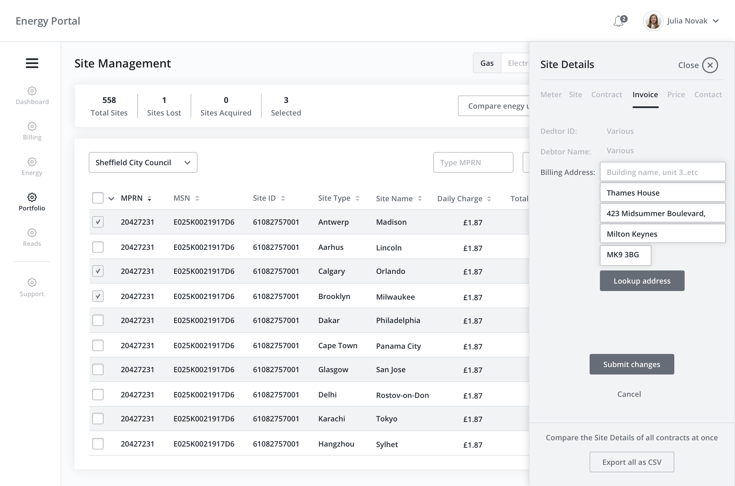
My first task is commonly to audit the company, client, state of design and assets/artifacts. By doing this I can create a benchmark of expectations. progress, common vision and relationships. I met with the knowledge experts and stakeholders in a 1 on 1 format to avoid distraction and influence and get to know them as well as their role, goals, dependencies and channels of communication.
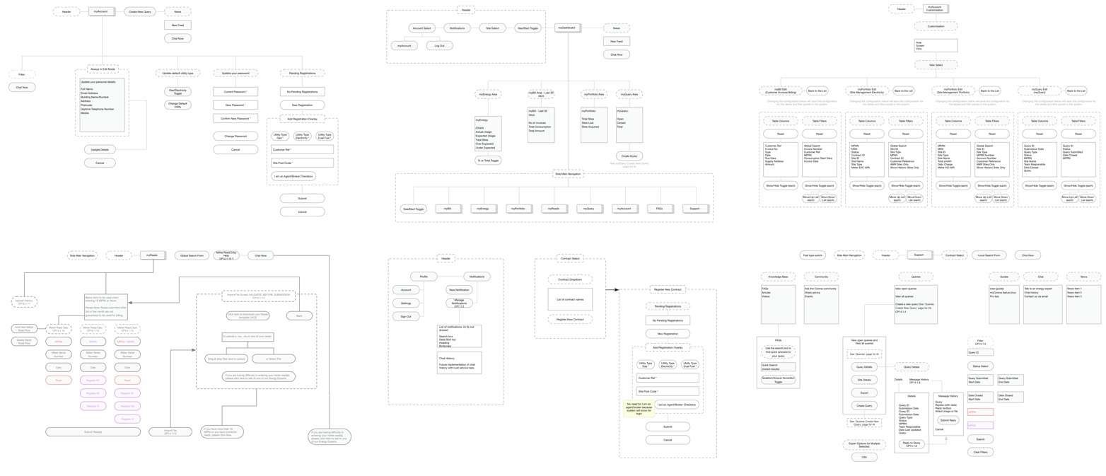
During the design audit I created customer journeys and information architecture maps for the current state that the product. This created a visualization that every stakeholder could see at any time throughout the project timeline. It is important to understand where we started and what opportunities lay ahead.
Identifying common user tasks
After conducting user interviews, customer service representative interviews, crazy egg heatmap analysis, Google analytics analysis, surveys, workshops and design sprints, I summized the main user tasks from their journeys. The main 3 tasks users routinely attempted to complete were:
- Exporting their latest bill
- Viewing energy consumption for individual supply meters
- Sumbit an energy reading
1. Exporting their latest bill
Evidence from Research
From the heatmap below (blured for identity privacy) you can see how the action of viewing the Billing page is the most popular user task. From analytics I can see that the Billing page is also the first page that the user visits when entering the site from any point.
Once on the Billing page, I determined that users wanted to download their latest bill as a primary action. This assumption was created and validated using Crazy Egg, supporting user interviews and conducting user, knowledge expert & stakeholder workshops.
Solution
With this assumption being validated, I designed a couple of solutions to give users a quicker and easier way to obtain their latest bill without having to login and navigate to the Billing page:
- A user will recieve their latest bill via email the first day it is due as well as upcoming bill reminders and post bill invoices
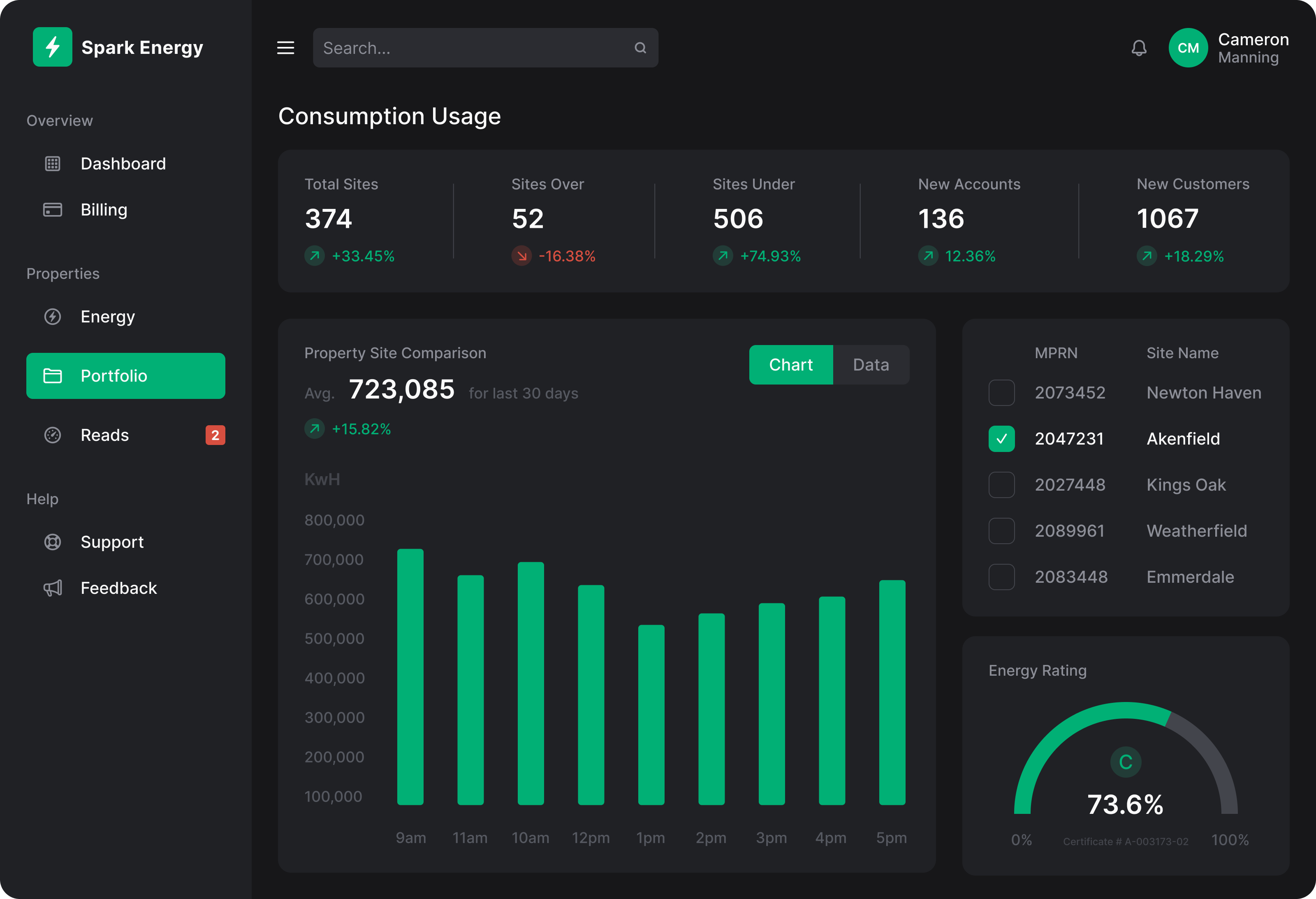
- All users have a personalized Dashboard as the Energy Portal's homepage
From user interviews and contextual enquiry, I observed that users would try to find a homepage button or some affordance that would take them to a starting point. There was currently no landing page in the portal so I designed a page that aggregated the user's most common tasks and relevant information to create the dashboard.
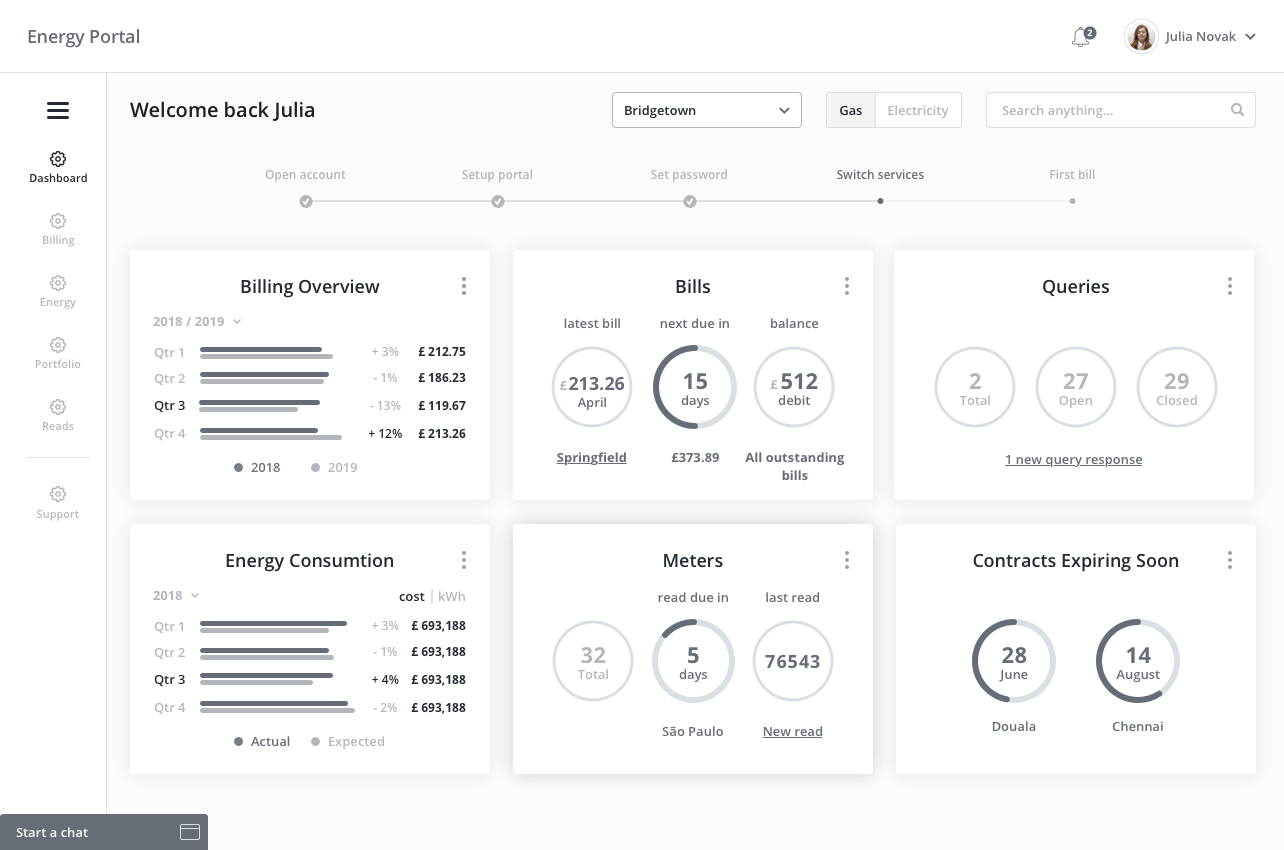
This information on the dashboard allowed quick links to routine tasks as well as system feedback, reminders and snapshots of useful data. It also included a timeline to show the user what stage of the precurement process they were in. This was based on feedback from users during a contextual enquiry session which highlighted user frustration around feeling out of control with their account switch over to the energy company from a competitor.
2. Viewing energy consumption for individual supply meter
Evidence from Research
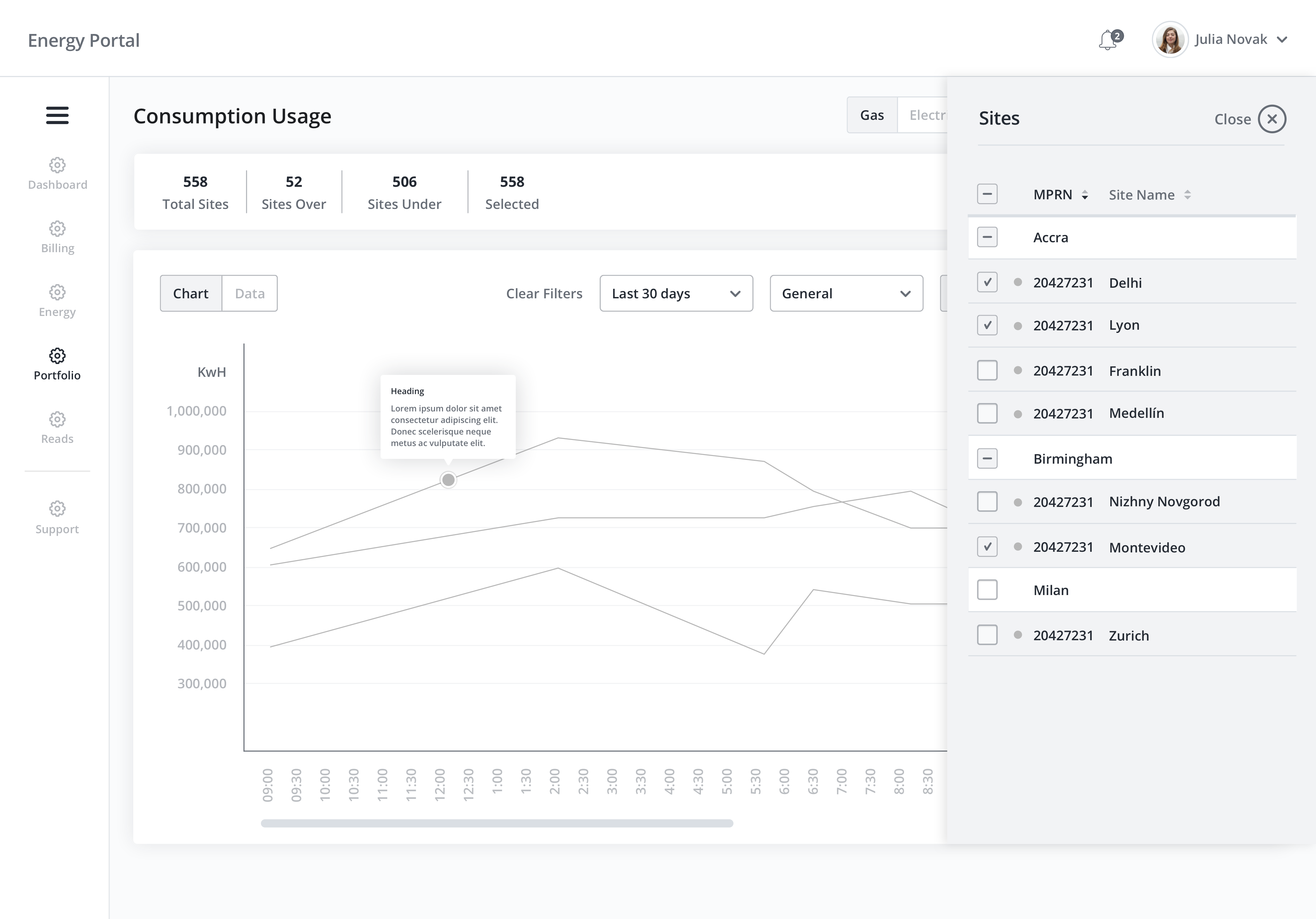
Both SMEs and larger organizations required the ability to compare energy consumption on a quarterly time frame. Research showed me that users also wanted to compare the current year's consumption with the previous year as well knowing how much the energy usage incresed or decreased each quarter.
Solution
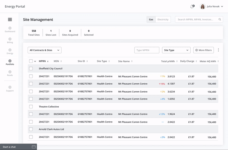
After validating the assumption with research, I designed screens that logically and fluently allowed a user to select different meter locations that they manage and then compare them on a chart. The chart is interactive and data points will show basic information such as the price and energy usage amount as well as supporting data such as weather spikes (cold snaps/heatwaves), meter outages and downtime. This extra information helps the user understand unexpected costs or savings so that customer support representatives are not overloaded with calls related to rational explainations.
Another way I helped users obtain information to complete their task of comparing consumption data was with the inclusion of a bar chart module in the dashboard. Users can see and choose 2 years to compare as well as see a breakdown of those years by quarters. The energy usage data can be switched to cost data with an easy toggle button. Users can also link off to the full chart and filters from this module. This satisfies users that are browsing and need to see that their expections meet the actual data at a glance.
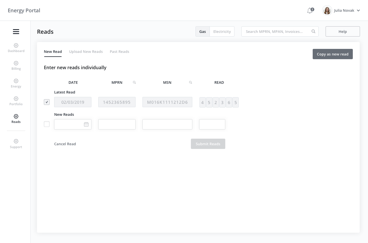
3. Sumbit an energy reading
Evidence from Research
Every month on the same day, customers need to submit an energy meter reading otherwise the energy usage is estimated. Through an analysis of Google Analytics, Heatmaps, Intensive Customer Interviewing and Contextual Enquiry I discovered that customers were having difficulty completing a meter reading for a number of reasons, one of which was that the input fields did not always match the amount of numbers that the customer saw on the actual meter.
Solution
To solve the challenge that customers were having inputting numbers into the portal, I designed a solution where the portal would analyse the meter serial number, know how many numbers were needed to be enetered and then display that amount of numerical fields. Additionally, I changed the read form so the last reading could be copied and used as a template for the current months reading. This would be ideal for SME customers as they entered only one reading per month and the meter details were always the same and only the number changed slightly.
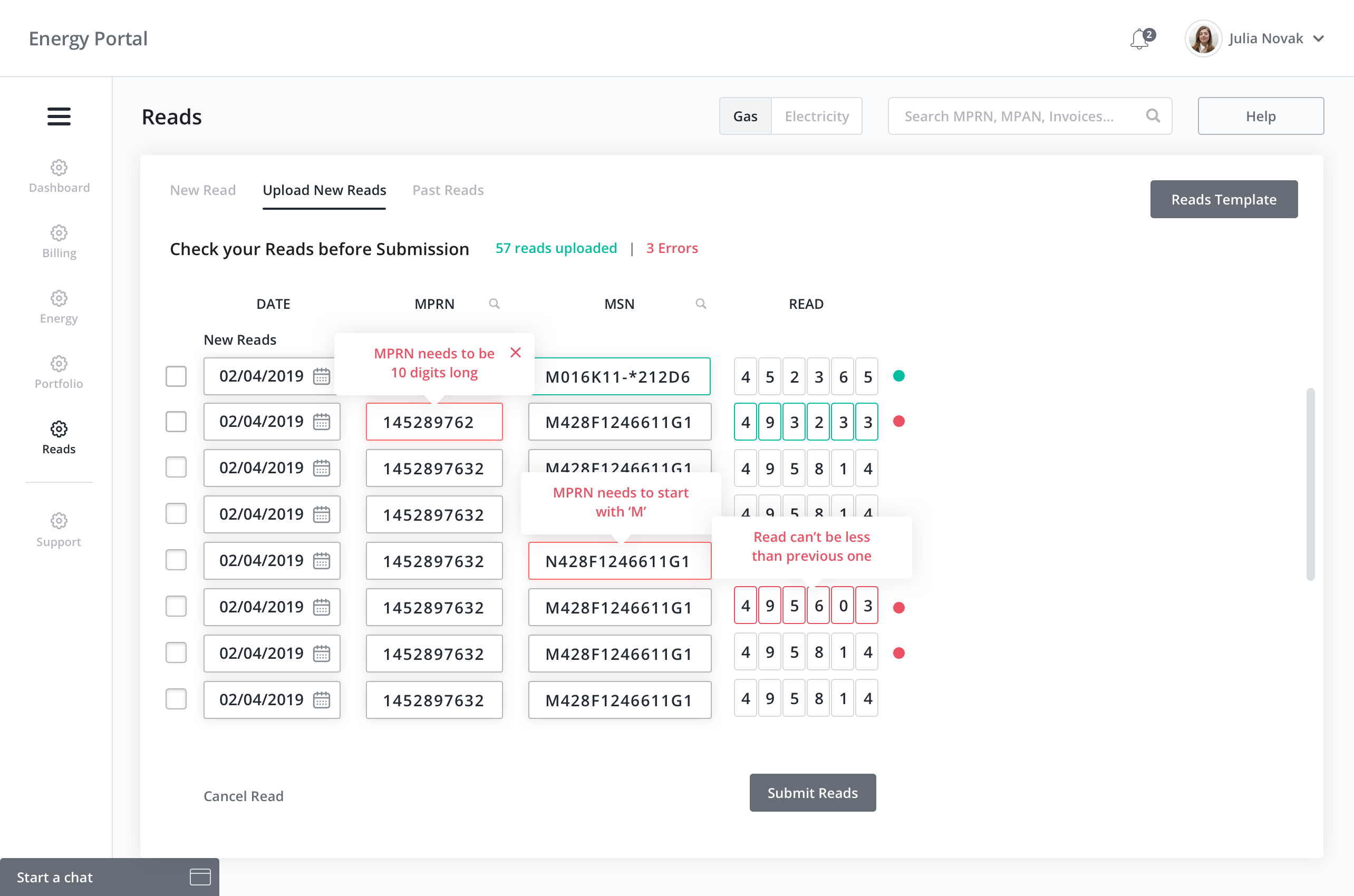
Another issue that arose from the workshop was the lack of intuiative error validation. Currently the system would accept the readings and then reply with an error message that generically stated there was a problem. When corporate and larger organizations upload a large amount of reads into the system, this feedback does not specify which reads are incorrect thus forcing the user to call customer service in order to solve the issue.
I designed an error validation system where feedback was color coded and descriptive. When a user uploaded reads, the system would scan the validity of each read and provide specific feedback as to what the user needs to change in order to correct the error. The total amount of reads and the amount of errors are written above the form. From there we can see that a red dot on a row indicates that there is at least 1 error in that row. When all errors in a row have been corrected, a green dot displays next to the row confirming the row is valid. Error descriptions are tooltips above the incorrect field and when all rows are free from errors the error tally will disappear and 'All errors corrected' message will appear in it's place. This will save time for the user allowing them to gain trust with the system as well as assisting Customer Service by reducing support queries.
Takeaways
These challenges and solutions formed a very small percentage of work that I created for this project. If I had more time to refine my process I would like to have spent more time on contextual enquiry with the customers as well as being able to obtain quicker access to them. To do that would mean that management would have had to allowed this access sooner and cut down the amount of evangelizing I needed to do to convince them to grant me access to the users.
From this experience I learned that there is no quicker way to success than sitting down with actual users and conducting passive interview techniques as I watch and learn from their routines with the current system. I would like to have been more assertive in the initial stakeholder kick off meeting in regard to getting access to users earlier and more frequently. I could have sited more specific examples to prove how essential it is to talk face to face with users in order to understand their specific needs and goals rather than waiting for management to decide for themselves based on their negative past experiences.
Let's chat more about this
This case study covers a small section of the overall User Experience Process that I conducted to comeplete this project. I'd love to share more with you on how I conducted and handled user workshops, team dynamics such as feature design retrospectives, design sprints and weekly knowledge sharing. So send me an invite to chat sometime and let's talk shop.