Edith Cowan University
Website re-design.
Live site: Edith Cowan University
Tools used: Photoshop, Illustrator, CSS, HTML, jQuery, Omnigraffle.
Description: This project was a re-design of the entire intranet and website for Edith Cowan University, Australia. The new re-design spanned across thousands of pages, so I designed highly detailed templates to keep the visual and interactivity consistent. In this brief case study I will outline some of the key features of the design process as a Lead UX / UI Designer on this project as well as a list of my most valuable take-aways.
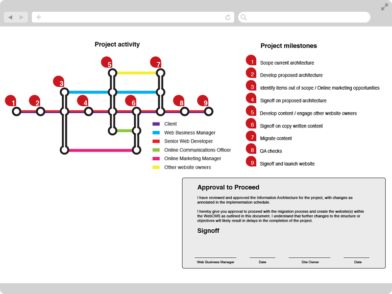
Process Map
In order to meet strict timeframes, a Process Map was created to define the order of tasks as well as the involvement of each stakeholder. Similar to a User Journey, a stakeholder can quickly and visually identify which tasks they will be required to participate in and at what capacity.
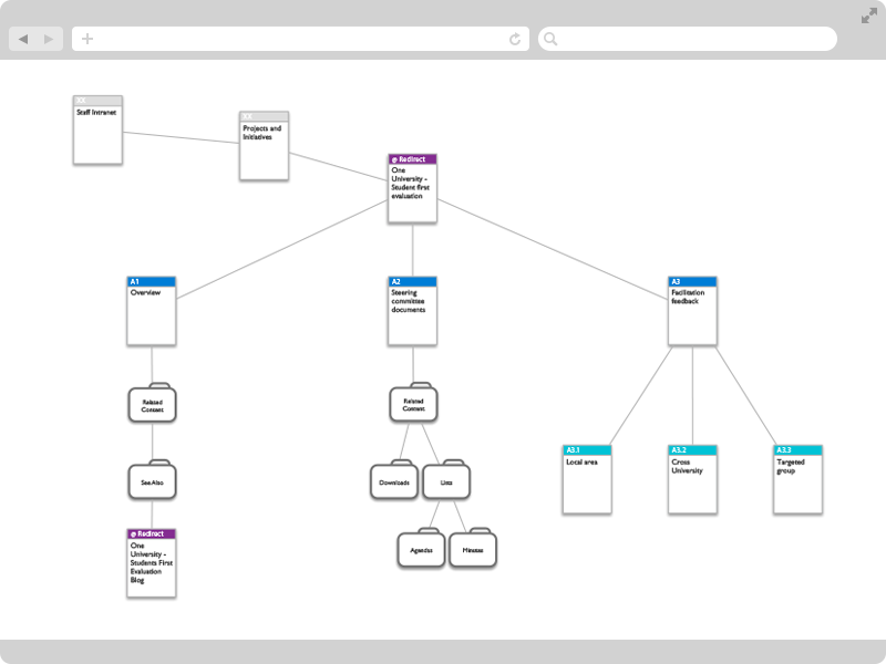
Sitemap
The university website has literally thousands of pages. In order to organize the schools, departments and disciplines, site maps were created. The maps identified the flow of information and displayed ownership between leaders and their product. Each milestone was documented and signed off by the department head or product owner in order to advance to the next milestone. In a big organization, milestones keep people focused on the immediate task and show progress towards an agreed goal.
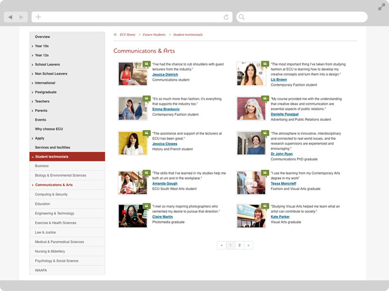
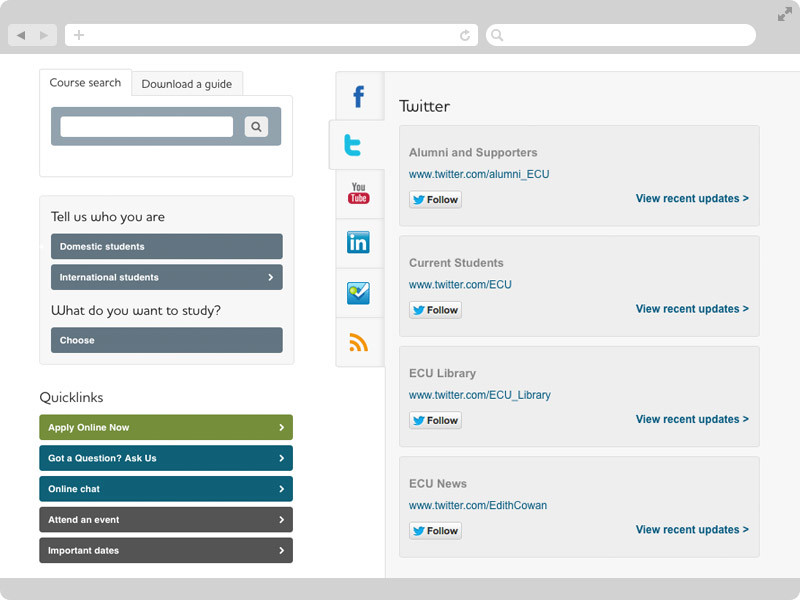
Assets and Patterns
The project started off with a lot of Sketched and later Hi-fi Photoshop concepts to re-design how features of the site would look and interact. I re-designed every element of the website by forming patterns. Assets included; search forms, search results, buttons, accordions, social media decks, testimonials, pagination, sidebar navigation and many more.
Asset Schema
In order to organize all of the design assets, I created an Asset Schema. This kept all the assets in one file and allowed for annotations and referencing for the developers. Each design asset was allocated a unique identifier and then referenced in the User Stories sheet. Example: User Story 012: As a Prospective Student, I want to search all courses (asset 034) the university has to offer from any page. This way, a developer, or anyone working on this User Story, can quickly reference the Persistent Course Search Box by following the asset 034 link.
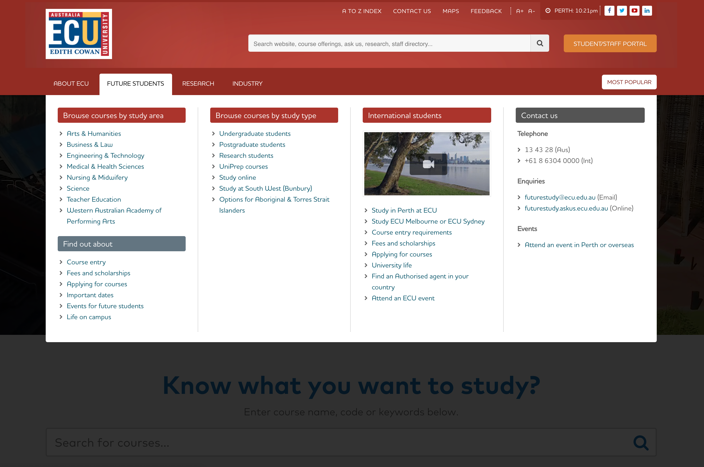
Mega Menu
This was the part that I liked conceptualizing the most. The Mega Menu facilitated more interactive media with the potential to include any HTML elements that we wanted to present. It meant that we could include a second level navigation without the awkward height of a common drop down. In the old version of the site, the main level navigation was restricted to single links, however, with the new Mega Menu I was able to categorize the sub-navigation links with the inclusion of video and images.
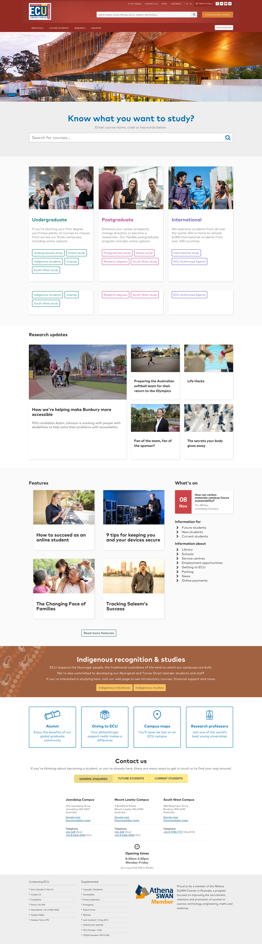
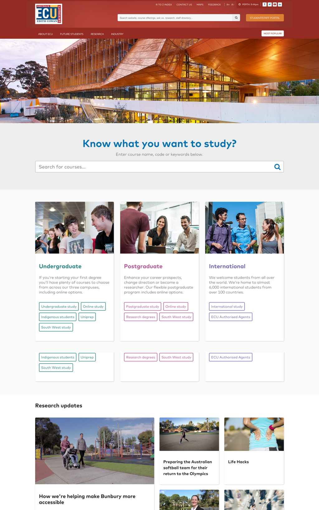
Final Design
The final design was extremely well received and filled the gaps in communication both visually and textually by implementing User Experience Design and Development methods. jQuery enabled us to display and present relevant and contextual information in an interactive way while the new strict color palette and strong design style guide gave us visual control over content hierarchy.
My key take-aways from this large scale re-design were:
- Define stakeholder roles and documenting project milestones
- Create an open line of communication and willingness of collaboration between stakeholders, the client, the UX Design team and the developers
- Re-use similar code, design assets and layouts by creating page templates and design patterns. These also need to be easily accessible to everyone working on the related user stories
- Provide deep research into the behaviours and mental models of the defined personas
- Have consideration to accessibility in relation to and not including; text sizing, colors and their meaning, audience demographics, content strategy, copywriting, balance of imagery and supporting copy as well as consistent terminology and information presentation.